
(This post is in response to an inquiry made by a reader asking how I created the imagery, covers, and maps for my books. The question was made on Discord, but the response was too large to be posted there. So now, everyone gets to see the response whether you wanted to or not.)
First off, I had an art scholarship to the art school Center for Creative Studies when I graduated high school.

Center for Creative Studies Detroit
That's not to say I learned much there, and only completed a year and a half before the money ran out. I was poor. I mention this to show that I planned a career as a commercial artist long before I thought of writing for a career. Later, after landing a job at a small company as an illustrator, I used one of the first graphic computers. (It was the size of a small kitchen.) No one else at the studio could figure out how to use it, but I was fascinated and stayed late at work (2-3am) for weeks playing with it and taught myself to make logos for the companies we had as clients. Later still, I got an early Compaq personal computer and began learning how to use a couple of new programs called CorelDRAW and this other neat one called Photoshop.

I mastered these programs. (Back then it was a badge of advanced achievement if you knew how to create drop shadows or create embossed text.) Then I learned how to use QuarkExpress. (The leading layout program--the MS Word--of its day. Everyone hated it, because of the tech support, but everyone used it.) With these three programs I founded an advertising agency of my own at a time before computer graphics was common, and printers had to be taught how to use the files. My wife took over getting the clients and I made her my president while I handled all the creative stuff as Creative Director. We had five employees and a beautiful office in a high rise glass building.

Highwoods office building, the home of Spectrum Design
I did ads and brochures for companies like AT&T and a few global businesses like ABB. Mostly tech stuff.
All of this is to say that I have a strong background in commercial art, and layout design. So when it came to making my own books, I had all the necessary equipment and all the know-how and skill. I had spent a decade professionally manipulating photos, learning how to use Bryce (one of the first 3D modeling programs) and basically laying out multi-page booklets. So making a novel was easy. I also painted as a hobby since I was twelve.


A couple of pieces I did in college — circa 1980 (so before computers)
Now, to the books
I told AMI (my first publisher) what I wanted for the cover of Crown Conspiracy: a castle in the distance and a river. I was thinking Alan Lee, but this is what they came back with.

I was less then pleased. It was a thumbnail, but it instilled no confidence. So, I painted a new one and gave it to them for free.

They liked free, so they used it. They liked free so much they asked me to do Avempartha’s cover, too. Truth is, I’m not that great of an illustrator. Marc is way better, which is why I pushed for him to do my covers when I went to Del Rey.
Now, the maps
So mapping Elan is a story lost to history. I created the very first map way back in 1989. I also had tons of notes about the world. These were locked up in my attic. When I started writing Crown, (in 2003-4) I searched for and found the box with all these notes and the map. Then—somehow—I accidentally threw it out thinking it was trash before I ever got a chance to even look at it. Yeah, I was pretty pissed. No one to blame but myself. So, I had to recreate everything from memory…starting with the map.
I went online and found there was mapping software. I downloaded it and played. This was very crude software (that no longer exists) but I managed to create a land form that was close to what I needed. Then I pulled that into photoshop and built out the rest.


This, however, doesn’t print well. So, then I had to lose the colors. Grays didn’t print either, so I had to go all the way to black and white.

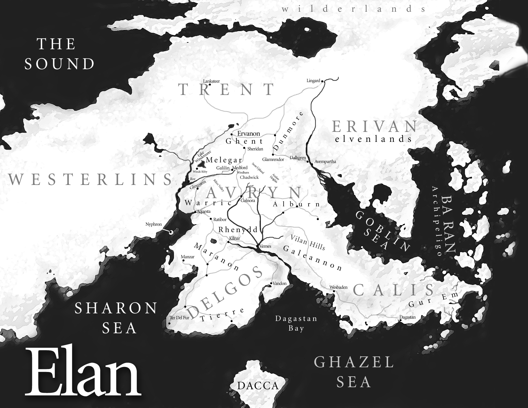
I never liked this map much, so when I began the Legends series, I did a complete rework. This time I went about the whole process differently. I began with the real world. Avryn is about the size of Ireland. So I began looking at satellite photos of Ireland. Starting with this, I copied and pasted sat images of different regions of the world blending them together until I had what I was looking for. Then rather than go black and white, I simply made the water white, and faded the landforms to near ghost images so the black text would be readable when printed.


I also created all the book symbols using Illustrator (which replaced CorelDRAW as the new Vector image draw program.)


And that’s the story of the maps and a bit about the visuals and covers. Hope this answers your question.
No comments:
Post a Comment